My architectural inspired relief tile was a very long process, and in the end I decided not to paint it because there were so many little crevices that I didn't want the paint to obscure. It was difficult because I'd never worked with clay before, but by getting help from people around me who had, I was able to figure out the tools and techniques needed to finish the piece. Because the piece was inspired by foreign architecture, I couldn't work from life. I used a picture I found online of a German castle called Neuschwanstein. I've actually been to Germany and I thought the architecture was fantastic, so I was happy to have the chance to recreate it.
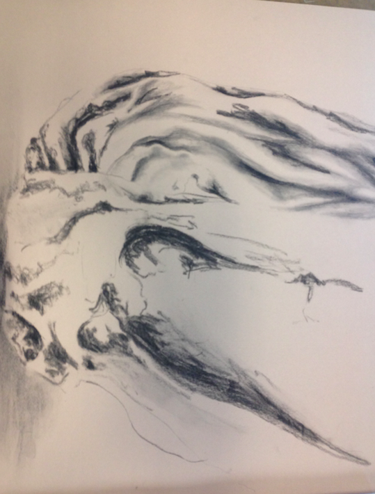 This is unfinished, but it was just a charcoal study of drapery. It was actually really frustrating, partly because it was from life and had no color, and there wasn't really a point of interest. I attempted to struggle through it for a while but as it's not my usual subject, I'll definitely have to practice studies like this before I attempt a finished piece. but I did learn how to use the charcoal a little better--using different techniques for different depths and textures.
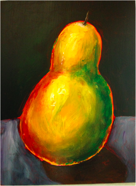 This was actually a pretty quick piece, since we were given such specific instructions on how to execute it. It was a study from life, not from a photograph. The personal choices I made with it were mostly to leave the border around the pear and what colors to use for the background and table. Since the pear was bright green, red, and yellow, I wanted to use more muted colors to offset that. I chose a deep green and grayish purple, with bits of green to reflect the pear and try and tie it all together. However, the pear still doesn't look totally grounded, which I think is because of its bright border.
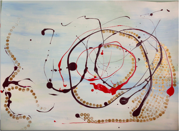 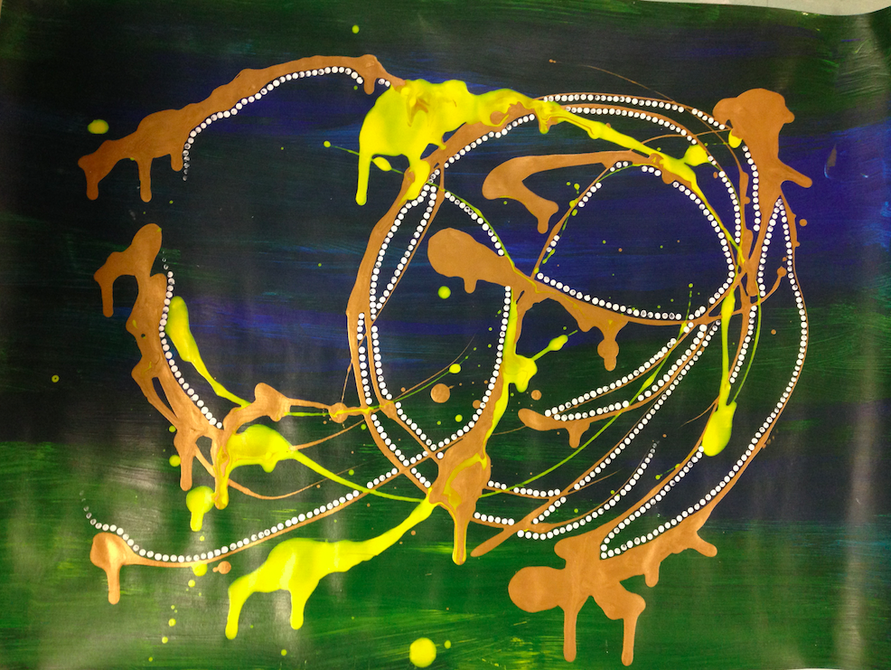 I decided to make two pieces for the abstract expressionism assignment with similar themes. I liked the way that the circles draw the eye around the paper, and the contrasting colors (yellow and blue, pale blue and orange) made the color scheme more engaging. I wanted to go for simplicity, so that not too much would be going on. In the first piece, there are tiny white dots that the camera didn't pick up, but I added those for texture. In the second one, I added the dots to contrast with the big, solid drips of paint. The drips were actually a happy accident--I was walking with the piece and it started to run, and I just let it go, which worked out well.
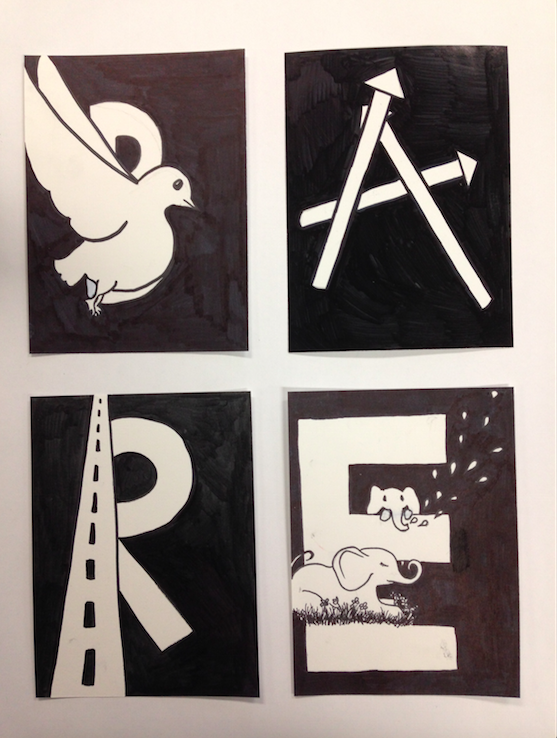 For my graphic alphabet piece, I used the word "bare". I had a prior idea of what I wanted to do with the letters, and I thought the word represented what this kind of piece should be like with the simple black and white scheme. I ended up using two different types of sharpies, which I didn't think would make a difference, but you can tell that the A and the R react to light differently than the B and the E, so next time I would test all my tools to make sure (especially for an economy-oriented piece like this) that the hues are all unified.
Concentration Ideas:
Oil painting Figure (especially women) Portrait The beauty in the strange/ugly Using unconventional color schemes to portray the ordinary 
Sorry about the late post, I just uncovered this! This was from earlier this year, a conticrayon
| AuthorWrite something about yourself. No need to be fancy, just an overview. ArchivesJanuary 2015 Categories |
 RSS Feed