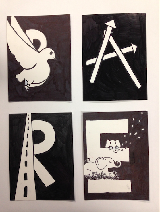
For my graphic alphabet piece, I used the word "bare". I had a prior idea of what I wanted to do with the letters, and I thought the word represented what this kind of piece should be like with the simple black and white scheme. I ended up using two different types of sharpies, which I didn't think would make a difference, but you can tell that the A and the R react to light differently than the B and the E, so next time I would test all my tools to make sure (especially for an economy-oriented piece like this) that the hues are all unified.
 RSS Feed