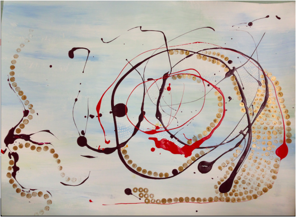
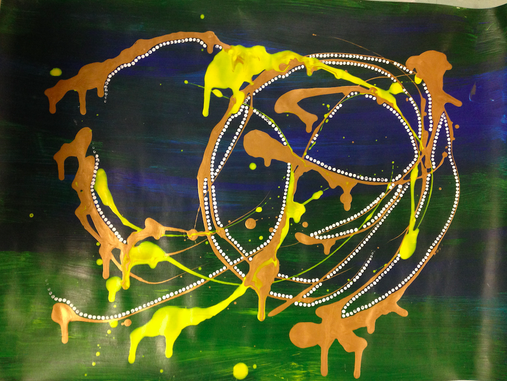
I decided to make two pieces for the abstract expressionism assignment with similar themes. I liked the way that the circles draw the eye around the paper, and the contrasting colors (yellow and blue, pale blue and orange) made the color scheme more engaging. I wanted to go for simplicity, so that not too much would be going on. In the first piece, there are tiny white dots that the camera didn't pick up, but I added those for texture. In the second one, I added the dots to contrast with the big, solid drips of paint. The drips were actually a happy accident--I was walking with the piece and it started to run, and I just let it go, which worked out well.
 RSS Feed