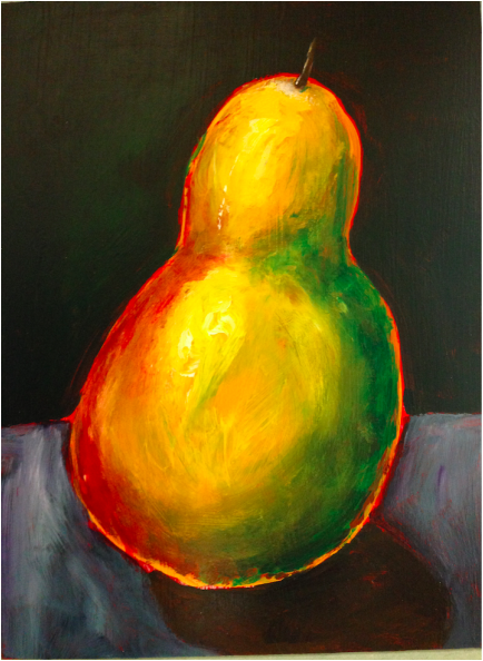
This was actually a pretty quick piece, since we were given such specific instructions on how to execute it. It was a study from life, not from a photograph. The personal choices I made with it were mostly to leave the border around the pear and what colors to use for the background and table. Since the pear was bright green, red, and yellow, I wanted to use more muted colors to offset that. I chose a deep green and grayish purple, with bits of green to reflect the pear and try and tie it all together. However, the pear still doesn't look totally grounded, which I think is because of its bright border.
 RSS Feed